March to June ‘24
Project Overview
First Steps
Defining the Problem
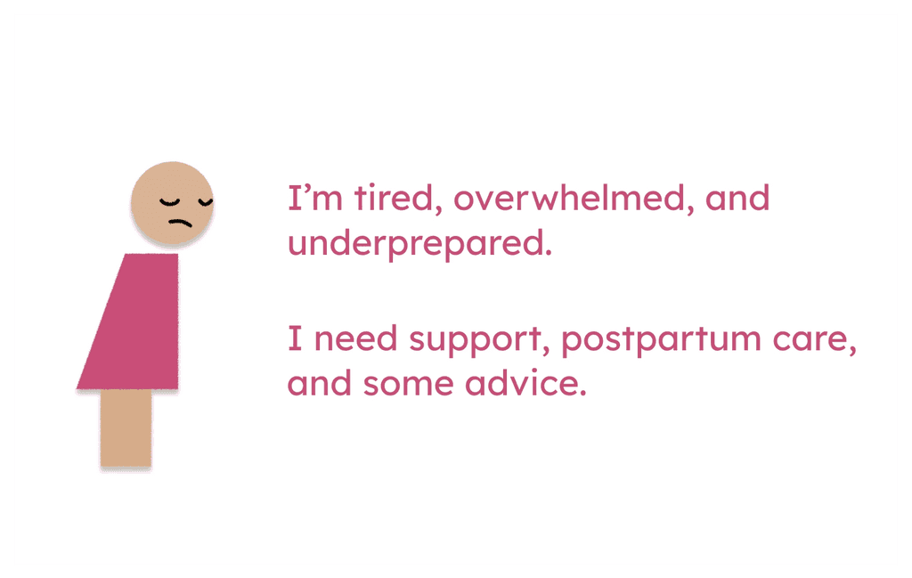
This was a unique experience as our team was able to gain first-hand insight through our teammate, since at the time of our project, he had a newborn. After learning of how many responsibilities he had to juggle, we wanted to make an app that would be able to help him—and others like him— out.
Parents with newborns need to know what their baby's needs are and why, so they can focus on taking care of and enjoying their new family member.
Market Research
Now, with an area of focus, I led our team in conducting a competitive analysis. After scouring the app store for different baby tracking applications, we came up with a list of six apps currently on the market.
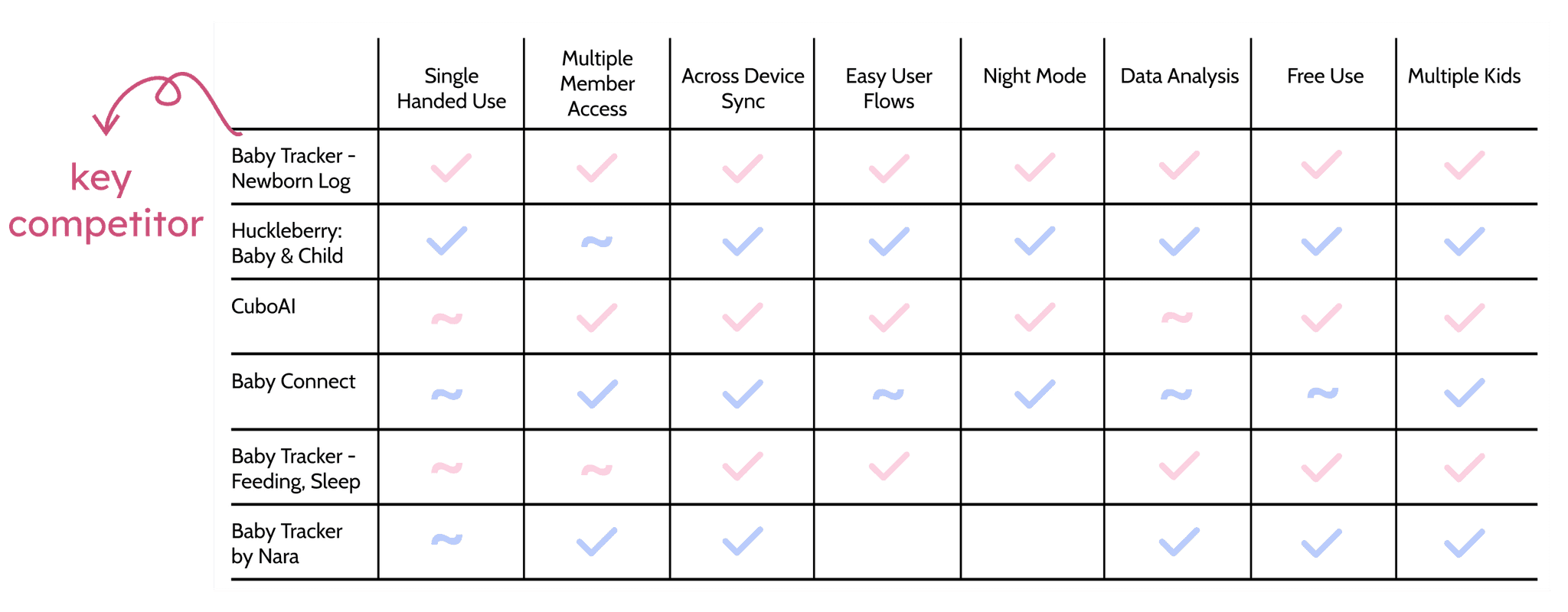
I found that Baby Tracker - Newborn Log, had all the features we wanted to implement and thought were important in our initial research. We had found our main competitor to test our app against.
However, just implementing those features would not set us apart in the baby health tracking market. To find out what would distinguish us from our competitors, we set out to gather information from our population of interest: parents and caregivers.
What I did:
Analyzed Baby Tracker - Newborn Log
Understanding Caregivers
We also looked to the greater population of caregivers to see if their experiences were similar to that of our teammate. To do so, I sent out a survey that covered topics like:
number of children cared for
caregiving habits
hospital experience
their usage (or non-usage) of caregiving applications
This method was very effective, and we learned many key insights:
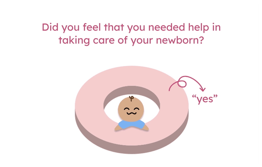

data sampled from 7 people
With this information, I posed to my team that we should include parent resources in our app. This would give parents a single app where they can track baby health, while also monitoring their own needs. Thus, saving them the extra work of looking for resources themselves. This would also be a feature unique to our application.
What I did:
Created & sent out the survey
Analyzed survey results
Found our app's distinguishing feature
Creating BabySteps
Putting It All Together
Caregivers need a centralized and consolidated resource to help them maintain their baby's health and their own wellbeing.
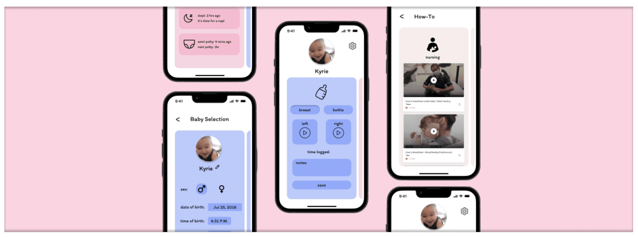
With our problem statement in mind, I could start designing our app. As a brainstorming activity, I did "crazy 8s" where I tried to brainstorm 8 different iterations of the home screen in 8 minutes. Going into this process, I knew I wanted a useful initial view to reduce navigation time and unnecessary clicks.
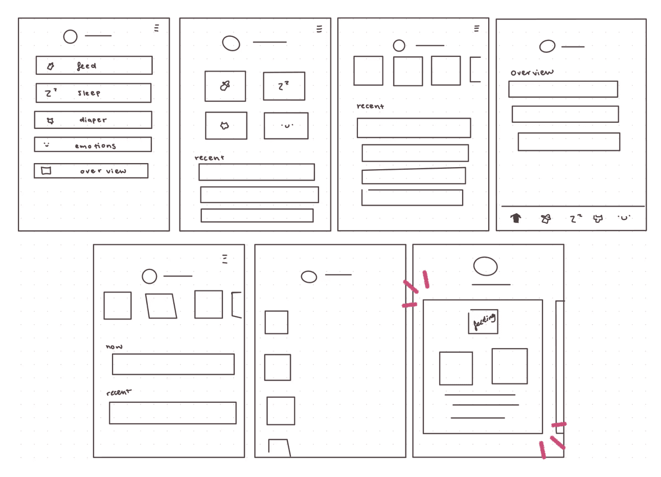
I ended up only coming up with 7, but a key idea was born from this process: the idea of a carousel.
With a carousel, navigating the app is easy and also allows for one-handed access. This is important as they should be able to use the app while holding and taking care of their baby. It should not take them extra effort to use an app that is supposed to make their life easier.
With team agreement, I moved on to making lo-fi mockups of our application.
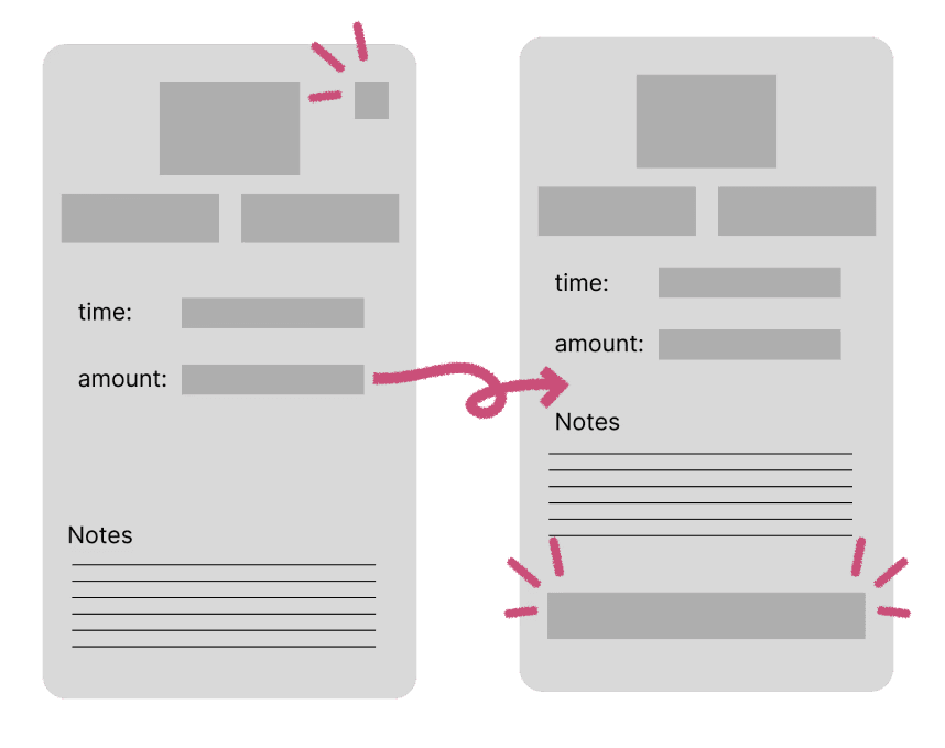
By making the lo-fi mockups, we realized that the save button would need to be bigger. Instead of having a checkmark somewhere hard to find and reach in the corner, a long button at the bottom would allow for easy access.
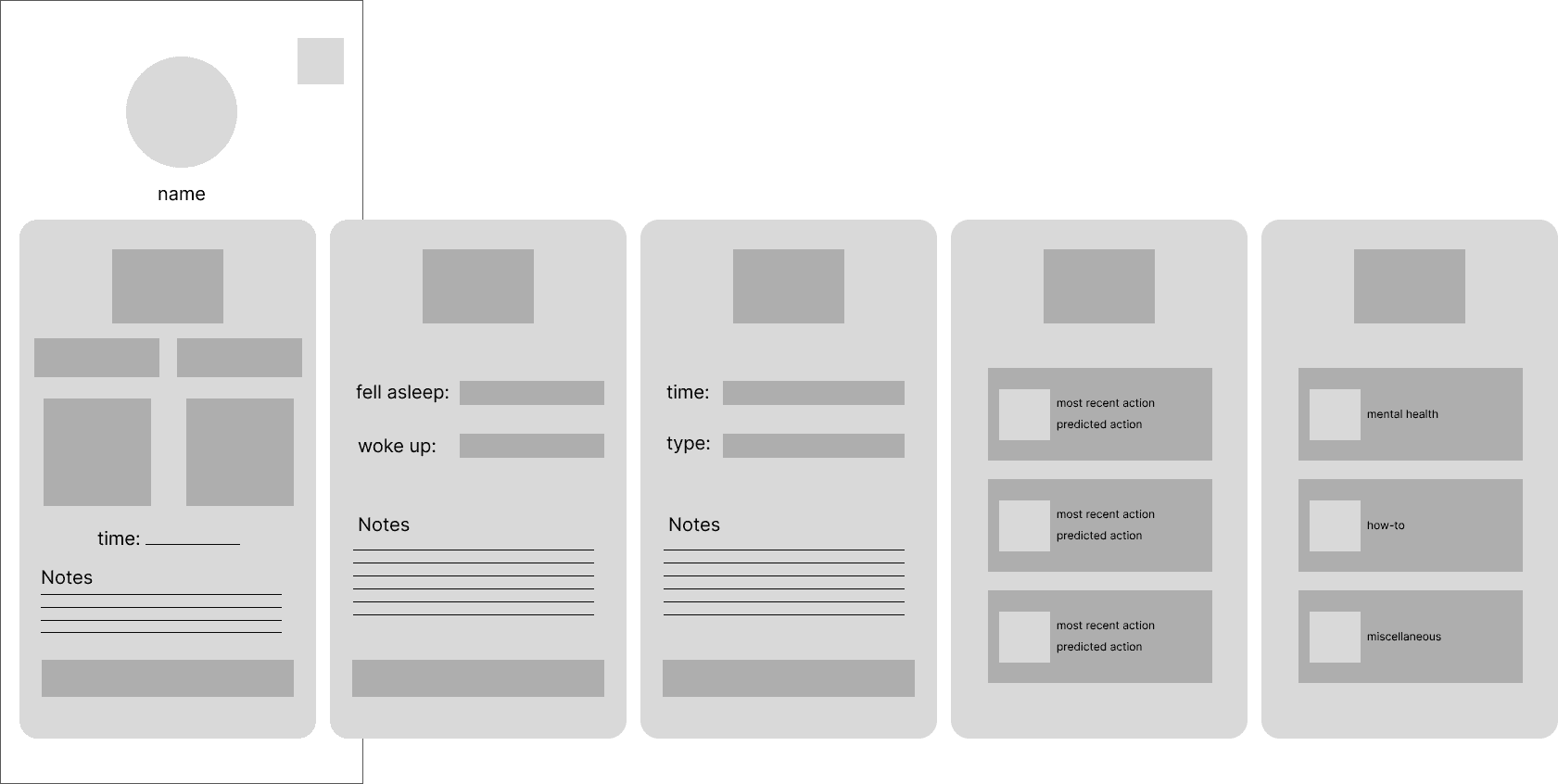
With this completed, I translated our lo-fi mockup into hi-fi prototype.
Challenges
Short Timeline
Since our project was only 10 weeks long, it was hard for us to do everything we wanted to. For example, we were unable to show our prototypes to prospective users, so any design iterations made were done through our own judgements.
We also had to overlap items on our timeline, instead of following a truly linear process. So before we could complete our user research completely, we had to start designing our application.
User Research
Additionally, our team only managed to collect 7 survey responses and conduct 1 interview, thus creating the possibility of missing out on vital user insights.
Next Steps
If this project were to continue, I would love to reach out to more prospective users and get their feedback and other general insights to inform our application's design. Additionally. I would take another look at the user flows and make the app design more comprehensive.
Reflections & Takeaways
Design, Design, Design
As part of this project, I learned about "Crazy 8s" (rebranded as "creative 8s" within my class). It is a great practice to take 8 minutes, with 1 minute per design to test out different designs. Since it was my first time using this type of brainstorm, I had trouble moving from design to design in a single minute. But the time constraint helped me to keep my head out of the weeds, instead allowing me to focus on rapid ideation, with the principle that there are no "bad ideas."
It was also a great way to see each of my teammates ideas for design solutions. It was interesting to see how everyone can come up with different solutions and what problems they chose to focuse on in their solution.
Overall, it is a great way to bring together an amalgamation of the best ideas born from our diverse perspectives.