Sleep Tracker
March '24
Project Overview

Getting to Work
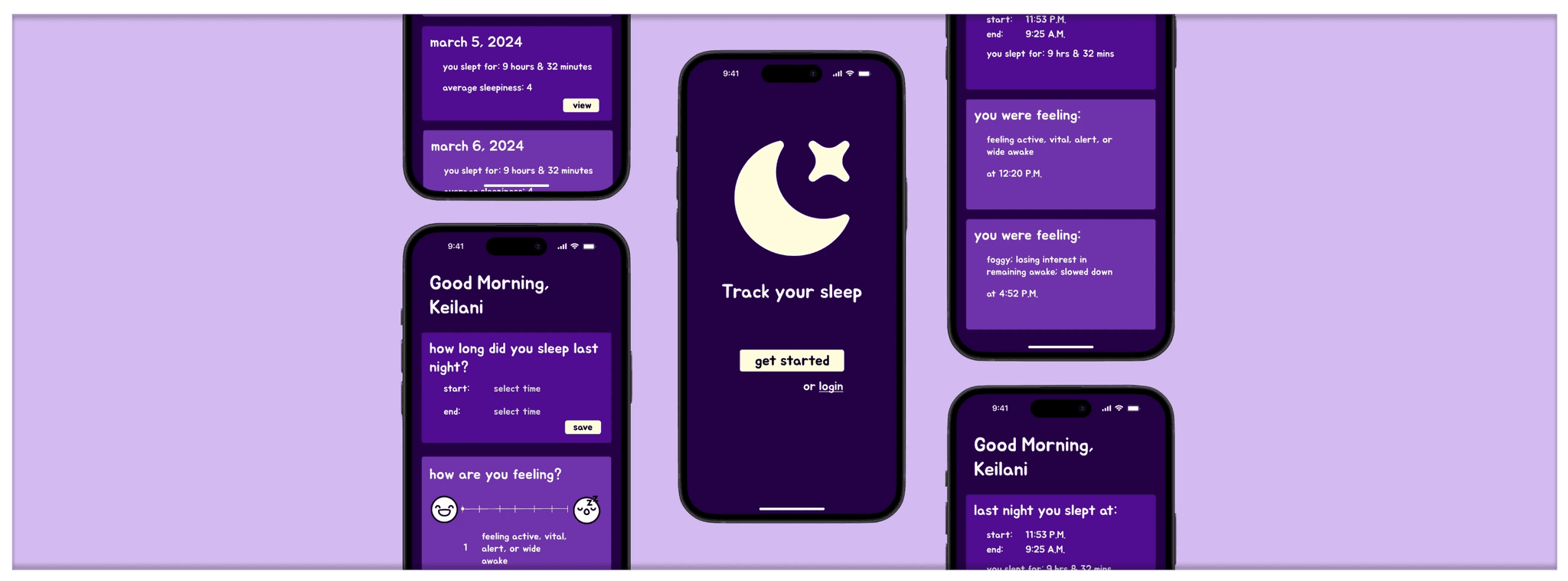
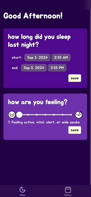
Logging Sleep
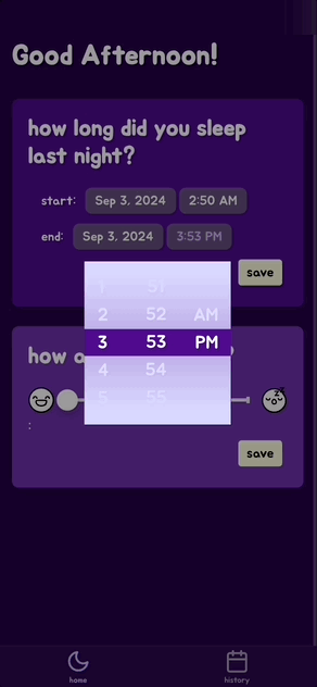
Keeping in mind that we needed to keep track of different dates and times on the back-end, I wanted to limit the chance of user error as much as possible. Instead of requiring the user to input their own text—which can led to typos or differences in format—we used date and time pickers, ensuring a proper format.
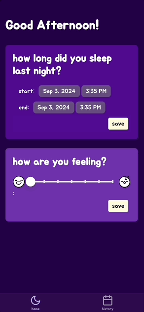
This not only helps the user understand what is being asked of them, but helps the organization of data on the backend.
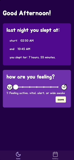
Logging Sleepiness
I wanted to ensure that users could see at a glance what they were rating, so I created two different icons:
One that represents feeling awake
One that represents feeling sleepy
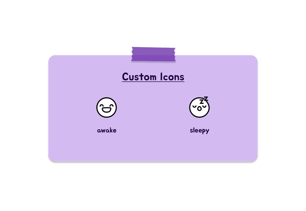
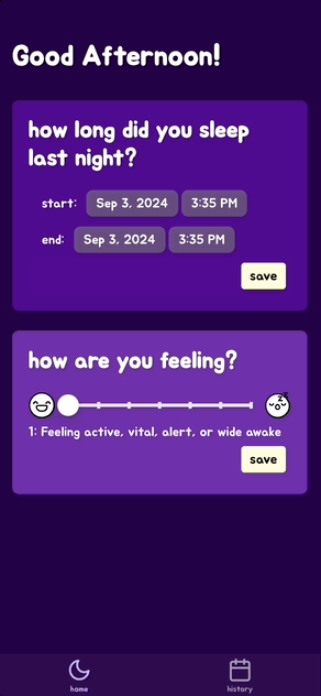
My partner and I felt this was the best way forward as it gave them a visual representation of their feeling, rather then just providing them with a numbered scale from 1 to 7.
Viewing the Data
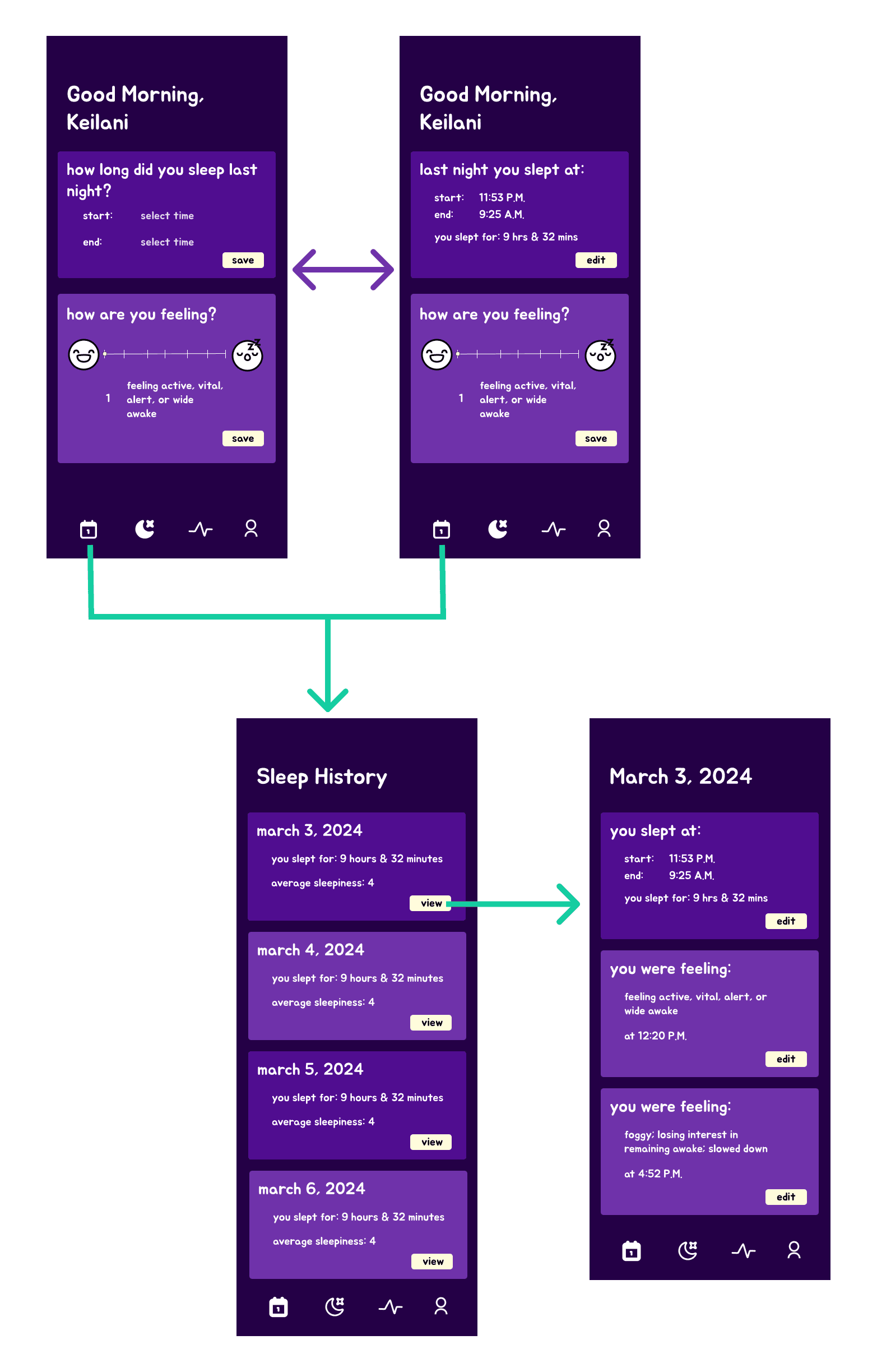
Viewing Sleep
I wanted this app to be as user-friendly and intuitive as possible. To do this, I decided that we should have a useful initial view. This would allow users to log and view their sleep straight from the home screen. Thus, immediately after logging their sleep, they are able to see it.
Viewing Sleepiness
I did not want to overwhelm the user with information every time they tried to view their sleep and sleepiness history. So as to not bombard the user with a lot of information, users are given a quick overview. There, they can see their time slept and average sleepiness.
If they want more information, they are able to click on the card to view each recorded log of their sleep and sleepiness.
Challenges & Adapting
Initially, I had many big ideas, which I had created both low- and high-fidelity mockups for.
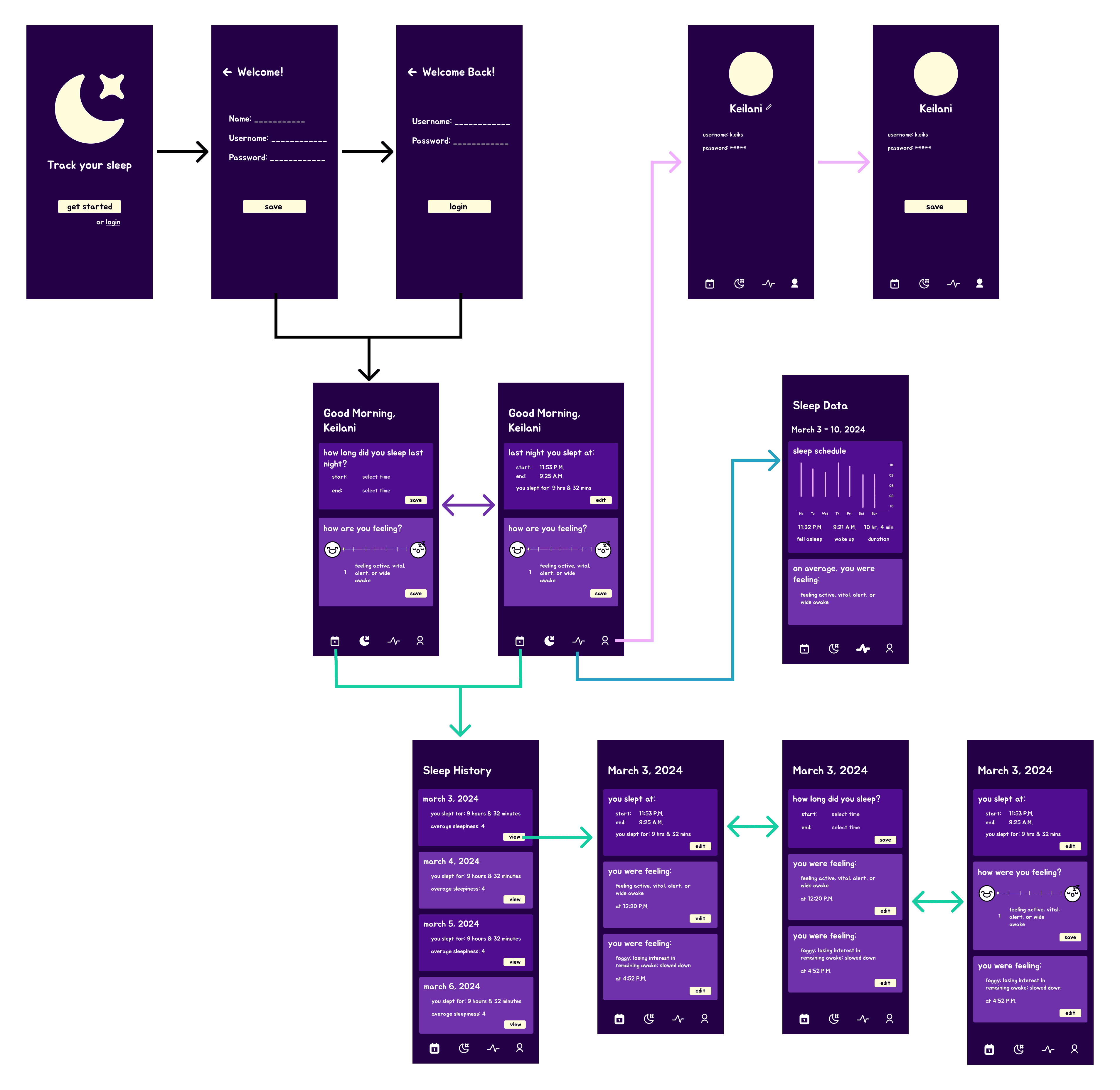
But as we moved forward in the project, my partner and I realized that we would not have time to implement everything. So, we had to scrap a few ideas and stick to the essence of the project: logging and viewing sleep and sleepiness data.
We ended up relying on these 4 screens to guide the code for our project.
We also had to remove the editing option for sleep and sleepiness data. Instead, we pivoted to focusing on error prevention by including a pop-up modal where the user could ensure they wanted to follow through with their action.
Next Steps
If I continued this project, I would love to include more features that could improve it's user experience.
Specifically, I would like to:
Revisit my initial designs
Test prototypes with prospective users (not just friends and family)
Allow the user to edit their sleep and sleepiness data
Add profile features
Allow users to mark their sleep goals so they can know how often they've met their goals
Reflection & Takeaways
This project reminded me that it is important to stay focused on the essence of a project, especially when given a short timeline. In this case, specifically, we had to focus on the minimum viable product.
There is a balance that needs to be maintained, where the key essence of the product is delivered while also ensuring that it can stand out amongst competitors, while being intuitive and enjoyable to use.
Overall, it is important to stay creative, yet pragmatic about what is accomplishable within a certain timeframe.